Followers

Wednesday, November 16, 2022

Major Project: Software Research

 On this post, I will be discussing the two pieces of software and compare both about their relevance, compatibility and ease in the process of creation for my website. Firstly I will talk about Adobe after effects. 


Adobe after effects was first developed back in 1993, in which it had two versions (both of which was made by the Company of Science and Art. The first version of Adobe After Effects, however, was only available on the Macintosh computer which was made by Apple. Since then program has improved over time, having better various machine rendering at the same time and a bit of motion blur as well.

Adobe after Effects as a program, is known to be very versatile, being able to accomplish tasks such as Animating namely : Basic 3D, Vector 2D, Kinetic Typography, UI/UX mock-up. Focusing on Visual effects, however, it can give access to the creation of smoke, explosions, fire, sparking, lightning, so on and so forth all realistic (technically possible) within a scene. 

I have used Adobe after effects and noticed there isn't much to use about 3D manipulation and modeling. It can be argued that it is still feasible and usable, however, there are other programs within my research that are better with that area.

All of this included within the program, it is to be considered a powerhouse and as advertised, versatile. However, when it comes to Adobe After Effects 3D modeling such as objects, models, atmospheres and environments. It can utilize existing 3D objects then edit them using the long list of capabilities it has but creating such scenes will be suitable for other program rather than Adobe After Effects.


Blender was first developed back in 1994 by a Dutch Art director named Ton Roosendaal. He was a self-taught software developer and as he was attracted to all things technical and creative, he had started a degree in Industrial Design in which he dropped to develop a different software titled NeoGeo. Within NeoGeo, blender was created with a purpose of becoming an app within said software, however this would change in 1995 where Roosendaal would invest $30,000 into a workstation by Silicon Graphics in order to develop Blender 1.0.

I already have tried Blender and immediately as I booted up the software, I immediately see the platform for 3D processing. It presented me with a cube as a standalone object and the grid where I can manipulate it. Though very confusing at first I studied the different tools by hovering my cursor onto them and studying them by simply using them on the object provided. Blender as a program immediately can be perceived as a software strictly for 3D modeling and the pipeline in my experience of using it at first.

Blender as a program, is a 3D computer graphics software and is also open for use to the general public (and since it is open-source, most updates are fixed by the community who utilize Blender which in turn makes bug-fixing faster than normal). The program is most used by people who are new to 3D modeling and to any effects software, however,  there are also some professional who still use Blender up to this day.  To put it simply, Blender as a software focuses on mostly everything on the 3D creation pipeline namely : 3D models, motion graphics, game creation, virtual reality, rigging, animation, rendering motion tracking and so on and so forth. It can also be said to be versatile in its field of capabilities as there are loads of options when 3D creation is in question. 

To summarize :
  •  Adobe After Effects
    This computer graphics software focuses more on Animating and everything on the 2D pipeline. When focusing on creating effects in scenes, Adobe After Effects is one of the best softwares one may use in this area. However when the 3D editing pipeline is in question, it may be better to use a different software for it.


  • Blender
    Blender as a computer graphics software creates a smooth process when the 3D editing pipeline is in play, since the program gives a long list of its capabilities when you are to tackle 3D. Though Adobe After Effects is better when it comes to adding effects to a scene, Blender makes creating objects onto a scene very accessible which is better for my creation of the major project.


    All of this being said, I will be utilizing Blender for my major project plan rather than Adobe After Effects since it is the most suitable between the two of object creation onto a scene.

References :

Foundation, B. (no date) History, blender.org. Available at: https://www.blender.org/about/history/#:~:text=Blender's%20History&text=Roosendaal%20wrote%20the%20first%20source,tracer%20built%20for%20the%20Amiga. (Accessed: November 16, 2022).

Chillingworth, A. (2022) The Pros & Cons of using Blender Software: Epidemic sound, This is the Epidemic Sound blog | Epidemic Sound. This is the Epidemic Sound blog | Epidemic Sound. Available at: https://www.epidemicsound.com/blog/blender-software/#:~:text=What%20is%20Blender%20software%20used,the%20entire%203D%20creation%20pipeline. (Accessed: November 16, 2022).

Chillingworth, A. (2022) The Pros & Cons of using Blender Software: Epidemic sound, This is the Epidemic Sound blog | Epidemic Sound. This is the Epidemic Sound blog | Epidemic Sound. Available at: https://www.epidemicsound.com/blog/blender-software/#:~:text=What%20is%20Blender%20software%20used,the%20entire%203D%20creation%20pipeline. (Accessed: November 16, 2022).


Tuesday, November 15, 2022

Website Creation : About Page

In this post, I will be discussing about my "About Me" page on my website. Below is the contents of my About me page.

Welcome, my name is Alan and I am interested in the art of “illusion”. Anything that pertains to editing media is what peaks my interest.

Looking back, amongst the oasis of ideas , there wasn’t anything that gave me the same fuel of passion as VFX. I tried drawing, pursuing maths, searching and researching in science, and other different opportunities that were presented to me, however, VFX striked me the most.

Currently, I am a VFX student studying Media at De Montfort University International College (DMUIC), Leicester. My desire is to use the capabilities of VFX, to create the 
scenes, effects and text that can light the furnace in people to go out there and explore this world I am in; the exciting world of VFX...


I will then add this as my bio on my website. Firstly, I went to the left-side of the website creation tool in order to add text boxes. The first text box will contain the title of the tab "About Me" and the second would contain the contents about me. Before adding the text, I first made sure to set the font style to Lulo Clean and font size 18px so that it is pleasing to read. After which, I added the contents of my about page and the title of the page. 


I also added a square and adjusted its color and size to act as a background for the photo of myself and a bit of extra information not included in the about me contents of the page. This area also included my social media links which I added via the left-hand menu of the website creation tool that was under the "Apps" section. I edited a simple photo I took myself using the crop tool that the website creation tool had when left-clicking the photo.


After finishing and polishing the desktop view of my about page, I proceeded to edit the mobile view since it was not organized the way I wanted it to be. I did the same process as my desktop view pertaining to font style, font size and font color. 


Tuesday, November 8, 2022

Website Creation: Contact Page

In this post I will be discussing the creation of the contact page section of my website, which I took inspiration from Vincent Frei's website

Firstly, I created an introduction section for my contact page. Here I took a picture of my hand for a non-copyright and very fitting image for my contact page introduction. Here was the picture I took after I edited and cropped it to fit my website contact page section. I used an iphone 12 on its auto settings.


1/800 sec. f/1.6 4.2 mm ISO 32.

I then added a square to fit the background of the two text boxes I was planning to add to this section and shaped it to fit the area. I then added two text-boxes for the title containing "Reach out" and the introduction contents of my contact page. I then adjusted the font style of Lulo Clean and then fixed the font size to 18px to be easy to read for the viewers.


In the latter part of the contact page, I focused on making it very simple and accessible as I also took inspiration from the website of Vincent Frei and its section of Contact as shown below.


I then made took a template for a contact form sheet that the website creation tool Wix had provided which was located at the left-hand side of the tool under the "add element" tab. Here I tweaked most of the content within the template to fit the simplicity and accessibility I envisioned for this part of my section. Making sure the font is black and the font were serif, I then took a text box and added it to the section of the template which looked aesthetically pleasing to place it (I added the text box via the left-hand side menu of the website creation tool Wix). I also edited the background of the section to make reading the text easy for the eyes of the viewer.


Lastly, I simply added a location app from the left side of the website creation tool Wix under the "add apps" tool. Then I set the location to De Montfort University, Leicester.


Website Creation : Research and creation of Initial Gallery

 Here I will be discussing the short process of me creating the "Hipno Gallery", in which I took inspiration from Vincent Frei from his website of "Art of VFX" in the tab of "Breakdown and Showreels."


From there I began working on my Gallery tab,


 There was a template provided by Wix in which I simply tweaked the different elements namely : The title, the description, and the contents of the gallery the default template had. I changed the fonts of both the description and of the title to the common font of my website alongside the light color (Lulo Clean with a #96CBD8).


Lastly, I changed all of the photos the default template had and its whole collection then replaced it with my own photos and created a collection alongside it. I utilized my brand logo, the platform logo and lastly the advertisement project I edited using Adobe Photoshop in order to fill the gap removing the default content made.

Here is the final outcome of my initial Gallery,


Website Creation: Home Page

 In this post, I will be discussing the process of creating the home page of my Website for Alan Mark. 


Firstly, I used one of the templates the website creation tool Wix had provided in order to make the website creation easier. I then proceeded to change the trip background of each section in order to make the website's home page aesthetically pleasing. Next, I added a video to the start of my homepage closely resembling my research of Allan Mckay's website as shown below.


I then added the video box tool that was included in the left-hand menu of the website creation tool Wix and formatted it to fit the website as close to the video on Allan Mckay's website. I took the videos included within the looped video of the website within the Kimberlin Library of De Montfort University.


Secondly, I created a simple introduction to my website. I added two  text boxes that were located at the left-hand side of the website creation tool Wix. The first text box will contain the title of the tab "Meet Alan Mark" and the second would contain the introduction. Before adding the text, I first made sure to set the font style to Lulo Clean and font size 15px so that it is pleasing to read. After which, I added the contents of my introduction and the title of the page. 


I went to another section the template the website creation tool Wix had and tweaked its contents to contain some photos of my "Recent Works. Firstly, I added a singular text that was in the menu of the left-hand side of the website creation tool Wix and added the title of "Recent Works"with the font style of Lulo Clean and added an effect to the font to make it seem like it had a Holo-afterimage. I then added an app that presents the photos and goes through them one by one which I added via the left-hand side menu the website creation tool Wix had and it was under the "add an app" option.


Lastly, I added a section onto the template the website creation tool Wix provided that showcases my first project for the VFX film I am creating. I firstly added a square and made it white in order to create a background for the text I am about to put onto the area and sized it appropriately. Once that is accomplished, I then added 2 text boxes, one containing the title "Project 0.1" and the other containing a short description of Project 0.1. I edited both texts to have the font style of Lulo Clean and font color of black to make it stand out from the white square. I also added the Holo-afterimage effect to the title text box to make it aesthetically pleasing. I then added a button that leads to Project 0.1 making it easily accessible. I finished this section by added a simple photo to advertise project 0.1.

On the area close to the footer of the website, I added a title button that viewers may press in order to return to the top of the page for convenience and design, alongside my social media links.


Here is the link to my website's homepage.


Website Creation: Research and creation of Footer

 Here I will be discussing how I created the footer for my Website.  The inspiration in its creation came from the website of Allan Mckay and the footer it contains. Here it can be seen that it firstly presents the brand of the name of Allan Mckay, alongside links to his social media. It is then followed by a submission to Follow his content and have it received by the audience once it is available. Lastly, the copyright is shown below to avoid anybody from stealing content from the website and its brand.


Below is my process of creating a footer for my website.


I started off using a template that Wix had and put it onto the space I had provided beforehand for my Website's footer. I then changed most of the text that the template had into my website's common font (Lulo Clean with a #96CBD8) to make the footer very pleasing to the eyes.


I also added my copyright onto the lower part of the footer with the same font style and font color. Then I proceeded fixing the button of my subscription.


Here I simply utilized a button template to make the button stick out. I made sure to use the light color of my website as to make it pleasing to the eyes and easy to spot amongst the dark background. I fixed the hover color as well to make it aesthetically pleasing.


Lastly, I added my brand name of "Alan Mark" alongside links to my social media accounts to help my footer stand out and Give it a professional feel. 

Here is the final outcome of my footer.


Website Creation : Research and creation of Header


 The header of my website was heavily inspired from the way Allan Mckay created his. 

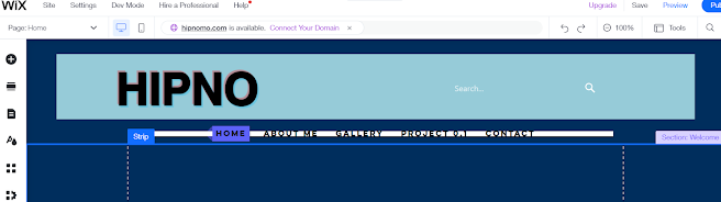
Firstly, I chose a template to fit my website header. One thing to accomplish first was the simple change in the strip's background color which was #96CBD8 on the color palette. Then I moved on to add my brand name "Hipno" with the Lulo Clean font and an effect of a hologram.


For the search bar that my website contains I utilized HTML code in order to design it and give it the function for searching within my website. I simply put in this code as follows:


<!DOCTYPE html>

<html lang='en' class=''>

  <head>

    <meta charset='UTF-8'>

    <title>Search Bar Demo</title>

    <style>

        body {

        background-color: #96CBD8;

        margin: 10px 40%;

      }


      form {

        background-color: #96CBD8;

        width: 300px;

        height: 44px;

        border-radius: 5px;

        display:flex;

        flex-direction:row;

        align-items:center;

      }


      input {

        all: unset;

        font: 16px system-ui;

        color: #fff;

        height: 100%;

        width: 100%;

        padding: 6px 10px;

      }


      ::placeholder {

        color: #fff;

        opacity: 0.7; 

      }


      svg {

        color: #fff;

        fill: currentColor;

        width: 24px;

        height: 24px;

        padding: 10px;

      }


      button {

        all: unset;

        cursor: pointer;

        width: 44px;

        height: 44px;

      }

    </style>

  </head>

  <body>

    <form role="search" id="form">

      <input type="search" id="query" name="q" placeholder="Search..." aria-label="Search through site content">

      <button>

        <svg viewBox="0 0 1024 1024"><path class="path1" d="M848.471 928l-263.059-263.059c-48.941 36.706-110.118 55.059-177.412 55.059-171

.294 0-312-140.706-312-312s140.706-312 312-312c171.294 0 312 140.706 312 312 0 67.294-24.471 128.471-55.059 177.412l263.059 263.059-79.529 79

.529zM189.623 408.078c0 121.364 97.091 218.455 218.455 218.455s218.455-97.091 218.455-218.455c0-121.364-103.159-218.455-218.455-218.455-121.36

4 0-218.455 97.091-218.455 218.455z"></path></svg>

      </button>

    </form>

    <script>

      const f = document.getElementById('form');

      const q = document.getElementById('query');

      const google = 'https://www.google.com/search?q=site%3A+';

      const site = 'pagedart.com';


      function submitted(event) {

        event.preventDefault();

        const url = google + site + '+' + q.value;

        const win = window.open(url, '_blank');

        win.focus();

      }


      f.addEventListener('submit', submitted);

    </script>

  </body>

</html>


I replaced certain parts of this HTML code to match the color of the strip background that I have set that was #96CBD8 on the color palette. The template for the tabs of my website was already there when I was only starting out in the website creation. I only changed the color of the button and the color whenever the cursor hovers over each tab you would select. That would be the finished product of my header of the website for Hipno.


Website Creation : Initial and Further Research

 This post will consist of my research about two visual effects websites namely : One website owned by a visual effects artist named Allan Mckay and another showcasing different films and shows that present the idea and capabilities of visual effects and its editing. 


Allan Mckay is an award-winning visual effects supervisor and leading technical director back at Hollywood, CA. His following works in films and visual effects are namely : The Equalizer,  Blade, The last Airbender, Transformers : The Dark Moon, and so on. His website will be a great source of research from the information I can infer.


The second source I have chosen was a website created and lead by Vincent Frei, a person who has worked in the visual effects industry for over 20 years of his life, and as such is considered to be apart of the Visual effects Society. This website will suffice since it would consist of 20 years of references from this information I have received.


Firstly, I would like to talk about Allan Mckay and His website, starting off with what greets you as you click on the link.


His homepage consists of different parts that explain the different achievements and services he can provide. Here in the header of his Website, His name/brand can be seen at the top left; Alongside this is the different tabs that his website can provide namely : The blog tab, the podcast tab, the film work tab, the tutorials tab and lastly the "why Allan?" tab. Alongside these is a button leading you to Allan's VFX toolkit and a search bar. The top of his homepage reels in the viewer with both the video and the "hook" it presents. Speaking of, the hook "Are you ready to explode your visual effects skills and level up your career?", helps in making the viewer want to view more about the website and the creator; piquing their interest. The way the video takes up the whole lateral space of the website gives this "movie" effect to it that adds up to the information the website wants to present.


The next part of his homepage consists of a short "about me" statement pertaining to Allan Mckay. Here it explains how he was just a kid from Australia and a high school dropout at 14. It also talks about his dream of Hollywood and a quote from him.


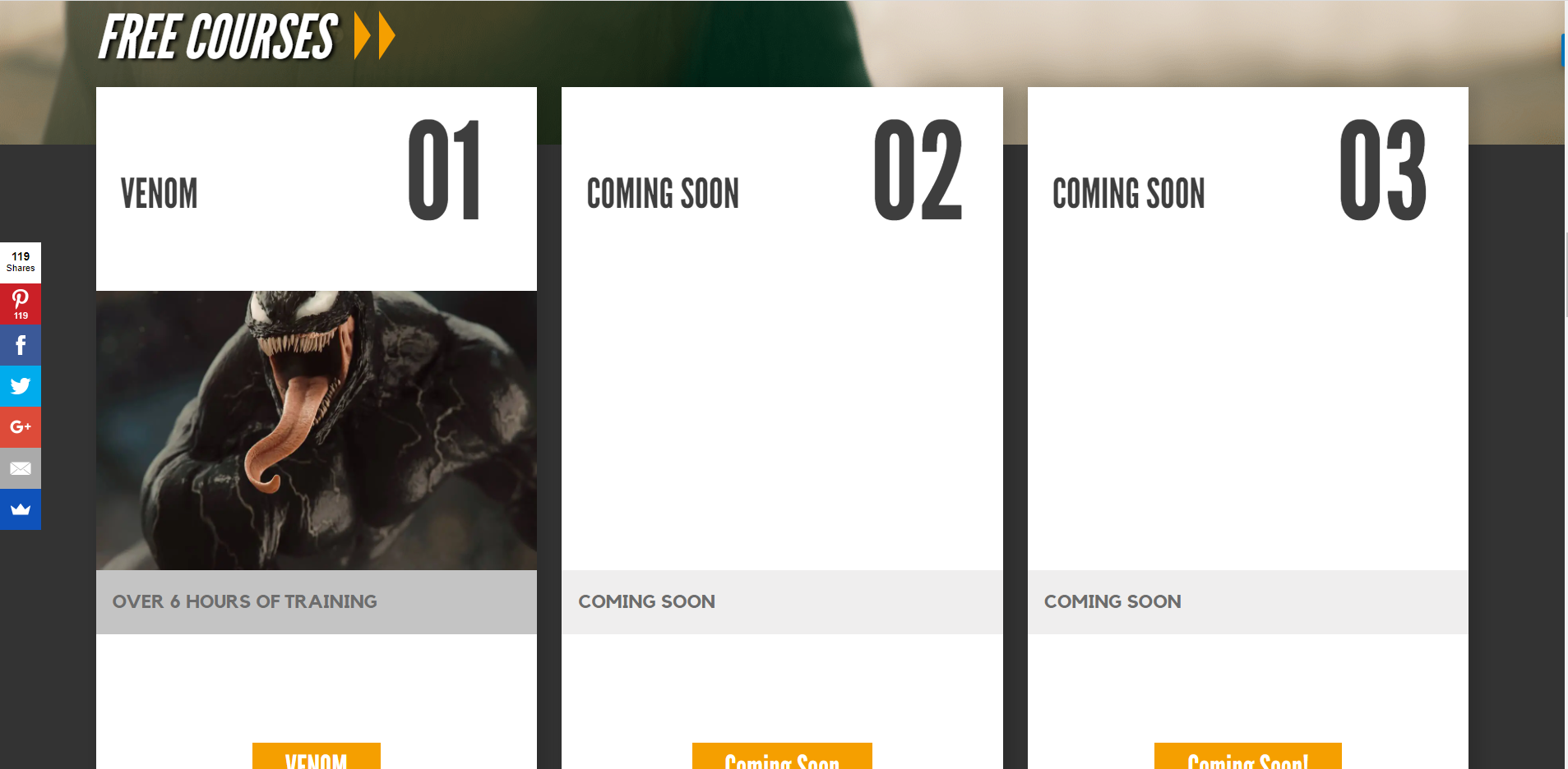
Free courses that Allan Mckay's website provides is next. Here are three tabs that present choices in which the viewer may choose which free course they want to partake in. The one that is available at the time accessed was a Venom course consisting of 6 hours of training.


Next, the clients Allan Mckay has given his VFX services to is shown through their logos. This I infer is used to show the credibility of Allan Mckay and how his website can help people who are interested in VFX and want to pursue the area of expertise.


In this part of his homepage, the most recent posts are organized in a manner that showcases an image pertaining to its theme and a small description to help the viewer get a taste of what each posts presents. This helps the viewer have more relatability to Allan Mckay since his posts of recent times may be what interests the audience at hand.


In the latter part of Allan Mckay's website, we can see the featured podcasts he had been in the workings in that included very distinguished people from the area of VFX.

Now let us talk about the website of Vincent Frei.


From the start of the website, I can already notice the theme of simplicity that Vincent Frei wants to portray, since this helps in helping put the audience in a position to focus more on what the content the website has and avoids them to stray from what is important. Scrolling down we can see that the website immediately presents the latest news about "Art of VFX", this can also be interpreted as recent works when it comes to a news website.


I also noticed that the images were very expressive and eye-catching to help reel in the viewer and feed their curiousity of what is happening within the world of VFX.


After a series of galleries about VFX, the footer of the website presents a simple about us containing :

"The founder and Editor-in-Chief, Vincent Frei, is working in the VFX Industry for almost 20 years all around the world. He is a member of the Visual Effects Society."

Which was then followed by various social media links and the title of the website that when pressed brings you back to the top of the home page.


When comparing the website of both Allan Mckay and Vincent Frei, it can be said that Mckay focuses more on being flashy and wanting to impress, Frei on the other hand, prefers to be simple since it focuses more on presenting information as it may be considered a news website for VFX. I will be utilizing the simplicity of design from Frei's website but will be adding the flair and wanting to impress that Mckay has within his since if the website is too simple, it will not catch the attention of people. 


References :

Mckay, A. (2018) About - Allan McKay - VFX supervisor and technical director, Allan Mckay. Available at: https://www.allanmckay.com/about/ (Accessed: November 8, 2022). 

Frei, V. (2021) Home Page, The Art of VFX. Available at: https://www.artofvfx.com/ (Accessed: November 8, 2022).